March 16, 2026
Apple has the best design team in the world and Formula 1 is the most technically complex sport on Earth. But right now, the broadcast is failing the story.
The growth numbers are undeniable:
- 135% U.S. growth: ESPN handed Apple the keys after growing the U.S. audience from 554,000 in 2018 to a record 1.3 million average viewers in 2025.
- Global scale: 1.83 billion cumulative viewers in 2025, with 76.1 million watching every race weekend—the highest since 2020.
- Mainstream takeover: 57% of new fans are under 35. This isn’t a niche motorsport audience anymore; it’s a mainstream entertainment powerhouse.
As former live news anchor and producer, I see the gap. Apple has the ecosystem—Watch, Vision Pro, M-series silicon—to deliver “Computational Racing.” Yet, the 2026 broadcast feels like linear TV.
Apple called 2026 a “transformative new era” for F1. To fulfill that promise, here are five places where Apple’s design DNA needs to show up before the next green flag.
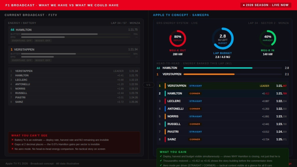
F1 races are decided by 0.050 seconds. The broadcast shows gaps to two decimal places. That’s a production choice that actively buries the story.
1. The energy graphics are failing the story
The biggest on-track change of 2026 is invisible on screen.
The new power units deploy up to 350kW from the MGU-K (Motor Generator Unit — Kinetic, the electrical motor that drives the rear wheels) alone. That’s nearly triple the previous spec. Right now the broadcast shows this as a simple battery bar — it is an estimate. From Race 2 we also got indicators for “Overtake” and “Boost” mode being active. But none of this explains why one car is faster on a straight without having pressed any button. That’s because of something called superclipping.
Superclipping is when the MGU-K harvests electrical energy while the driver is still at full throttle at the end of a straight — the car is essentially recharging and slowing slightly at the same time, which looks counterintuitive to a new fan. (Talking of new fans Sarah Kaye has an easy-to-understand visual explainer on superclipping.) Madeline Coleman at The Atlantic explains why these new modes will require TV graphics to carry the storytelling weight for home viewers.
Superclipping is the tactical battle of every lap. Viewers can’t see it happening.
So, how can we fix this and make this tension visible on screen? Well, the answers are already in Apple’s design language – the Apple Watch Activity Ring! It works because the brain reads a ring’s completion state faster and more instinctively than a bar — this is the Gestalt principle of closure in action. Apply it here: three rings to show the three dynamics at play simultaneously – a Deploy ring (instantaneous MGU-K output), a Harvest ring (energy recovered under braking), a Budget ring (megajoules remaining this lap).
Here’s a mockup I built using Anthropic‘s #Claude!
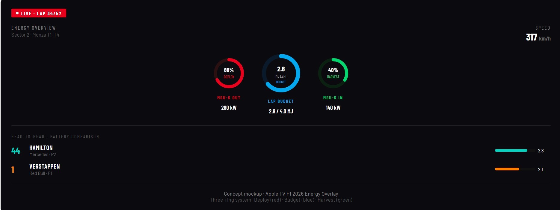
Put two drivers side by side in that view and you can see why one car is closing — not because of the draft, but because it has harvested 22% more energy over the last two sectors. That’s the actual tactical story of 2026. Right now, viewers can’t see it.
The energy story is the biggest miss. But it’s not the only one.
2. The thousandths of a second need to come back
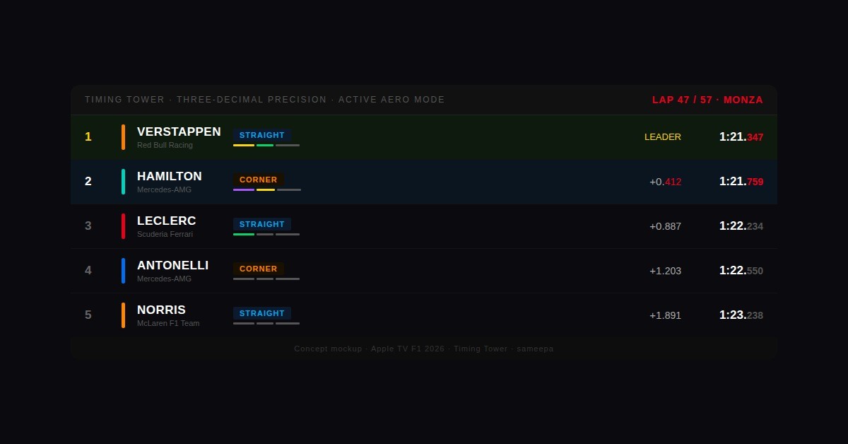
F1 races are decided by 0.050 seconds. The broadcast currently shows timing gaps to two decimal places.
The fan community noticed. The r/F1TV thread “We demand thousandths of seconds back on the timings graphic” has thousands of upvotes and is still going.
Ian Holmes and Dean Locke three decimal places isn’t just for purists—it’s the hallmark of F1 that creates tension on every lap. At two decimal places, a gap looks static. At three, you watch it closely in real time. That’s tension. That’s why people stay on the couch.
Stack the active aero mode alongside each driver — a small pill showing whether they’re in “Straight Mode” (low drag, fast on straights) or “Corner Mode” (high downforce, better through turns) — and the timing tower becomes a tactical map.
Precision and context cost nothing to add. The next one costs slightly more imagination — but the industry has already done the hard work.
3. New fans are losing the thread in real time — and there’s a whole industry built to fix it
This season’s broadcast has been using terms like “superclipping,” “torque fill” (the brief lag as the combustion engine fills the power gap when the MGU-K switches modes), and “active aero modes” and not always explaining them. For the fan who came in through Drive to Survive, this is the moment they stop following and start scrolling.
This isn’t a commentary problem. It’s an interaction design problem — and other sports have already solved it.
Ease Live places interactive graphic overlays on a live stream without touching or interrupting the main feed. They just deployed on Red Bull TV for Premier Padel — a sport with a similarly new global audience: viewership grew 30% year-on-year, with their overlays delivering a 50% increase in viewer duration, 68% poll response rates, and a 56% improvement in overall viewer engagement across global sports deployments. The feature that did the work for new fans? “Playbook” videos — short, tappable educational clips embedded in the stream explaining rules and tactics without pausing the action.
The F1 version is straightforward to imagine Royce C. Dickerson: a viewer hears “superclipping,” an icon appears at the edge of the screen. Tap it — a 15-second animation shows the MGU-K switching into harvest mode at full throttle on the back straight at Monza.
LiveLike ran the same approach for NASCAR, starting from the 2021 Daytona 500: in-app polls, predictions, a cheer meter, and alerts layered over the live race. In the first year, NASCAR‘s engagement with interactive features grew 22% over the season, with total impressions growing 140% — reaching nearly one million in October 2021 alone. LiveLike now works with Canal+, La Liga, Sky Sports Premier League, and the NBA.
The tools to retain new fans exist and are proven at scale. Now they just need to be adopted!
4. The AI opportunity is being left on the table
The F1 TV commentary team — led by Laura Winter (Congratulations to her on the birth of her son) alongside Alex Jacques, Jolyon Palmer, Ruth Buscombe (my girl crush!), David Coulthard, Sam Collins, and newcomer Juan Pablo Montoya — are committed to providing “digestible explanations of strategy calls, technical developments, and key regulation changes.” That’s the right intention.
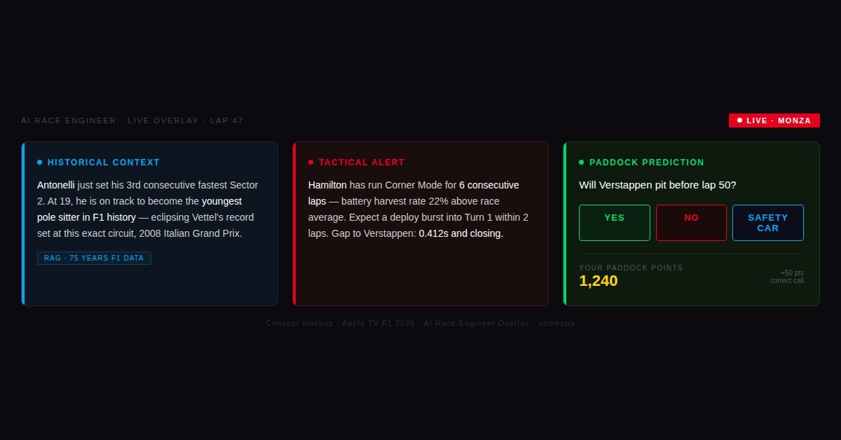
But no human under live broadcast pressure can hold 75 years of race data and surface the right stat in the right 10-second window. A model trained on F1’s full archive can.
When Antonelli crosses the line for pole at Monza, it already knows: youngest pole sitter since Vettel, same circuit, 2008 Italian Grand Prix. Computer vision tracking car trajectories can flag tactical patterns two to three laps before they produce an overtake.
This is about augmenting the booth. (cc Robert Patla ) It’s about giving producers and on-air talent a research assistant that never misses the moment and continues to add context for richer storytelling!
Four of these five fixes are about data and design. The last one is about people — how you use the ones already in the paddock.
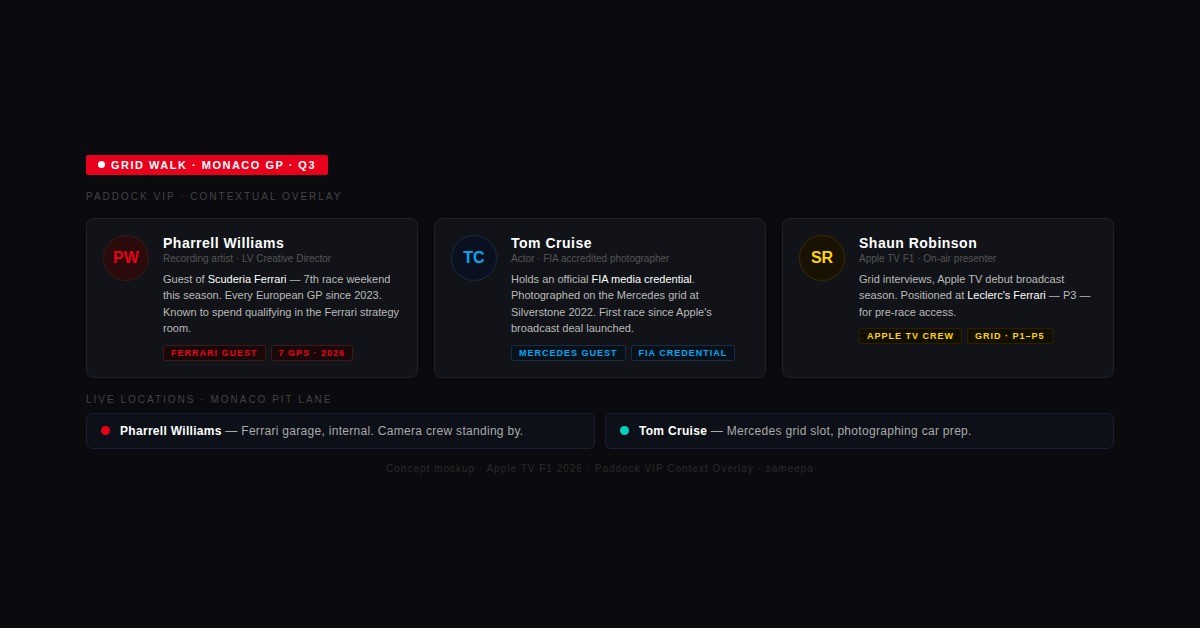
5. Celebrities at races are an asset — when used with context
The current approach: cut to someone famous in the paddock, no information, then cut back to the race. That’s dead air dressed up as glamour.
The better approach costs nothing extra. Pharrell Williams in the Ferrari garage — a brief lower-third: his seventh race weekend this season, always positioned inside the strategy room during qualifying. Tom Cruise on the grid at Silverstone — he holds an actual FIA (Fédération Internationale de l’Automobile) media credential. These are genuine cultural crossover moments for fans who came to F1 through music or film.
Context turns a cutaway into a story beat. Without it, they’re a cutaway that cost you 20 seconds of racing.
The number that puts this in perspective
Apple is paying $150M per year for these rights. Eddy Cue said at the partnership launch: “2026 marks a transformative new era for Formula 1… we look forward to delivering premium and innovative fan-first coverage in a way that only Apple can.”
F1 now counts 827 million global fans — 57% of new fans in 2025 were under 35, and 48% were female. That is not a niche motorsport audience. That is a mainstream entertainment audience that arrived recently and is still deciding whether to stay.
The 2026 power unit regulations produce more tactical complexity per lap than most sports produce per game.
The tools to show it — rings, spatial computing, AI inference, interactive overlays — already exist inside Apple’s ecosystem. This is the rare case where the hardest part isn’t building anything new. It’s just pointing what already exists at the right problem.
#F1 #AppleTV #Formula1 #SportsBroadcasting #SportsMedia #MediaProduction #F1TV #BroadcastInnovation
This was first published on LinkedIn.